Open Source
Publication-ready dashboards
from any data source
Connect to your database. Build charts with a visual editor, SQL workbench, or AI. Ask Claude Code to build a chart and push it automatically. Export to SVG, PNG, PDF, or PowerPoint. Deploy locally or to the cloud.
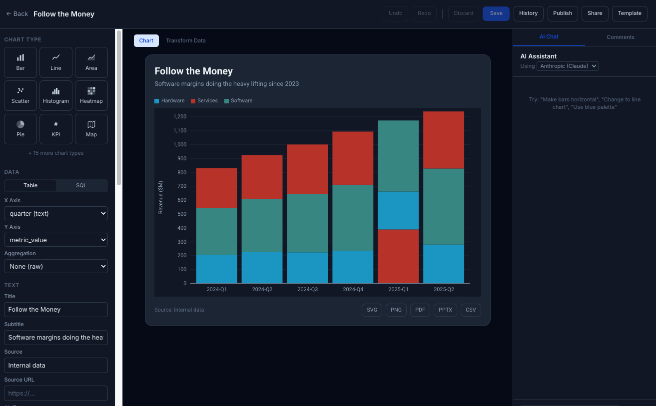
See it in action
Download for macOS
Free and open source. No account required.
Not sure? Click Apple menu → About This Mac. If the chip says "Apple M1" (or M2/M3/M4), choose Apple Silicon. Otherwise, choose Intel.
25 Chart Types
Classic charts, analytical types like dot plots and small multiples, 4 geographic map types, KPI cards, and more. All rendered as clean SVG with Observable Plot.
Any Data Source
Connect to Snowflake, PostgreSQL, BigQuery, or Google Sheets. Upload a CSV or paste data directly. Run locally or deploy to AWS.
AI-Native
Built-in AI assistant for writing SQL and refining charts. Or use the API with Claude Code to build any chart from a prompt — it creates the chart and pushes it directly to your Story Analytics instance.
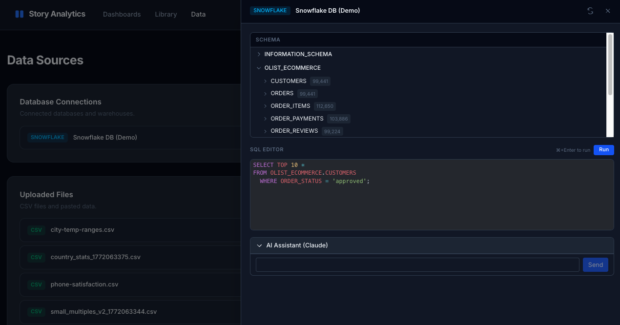
SQL Workbench & Python Notebooks
Query, analyze, and visualize with SQL and Python
Write SQL against any connected database with the built-in workbench, or open a Jupyter-powered notebook to combine SQL queries, Python code, and Markdown. SQL results automatically become pandas DataFrames, and any DataFrame can be exported back as a data source.
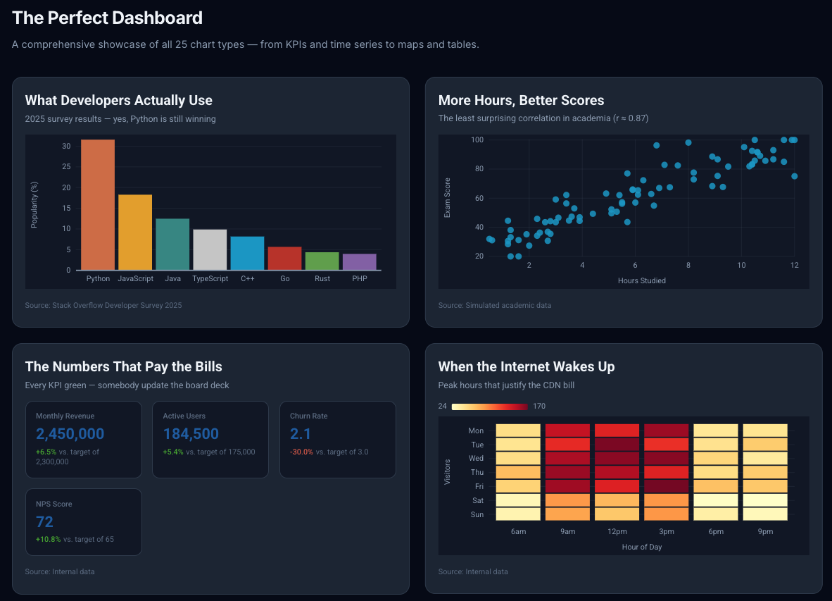
Dashboards
25 chart types on a drag-and-drop canvas
Bar, line, scatter, heatmap, KPI cards, maps, small multiples, and more. Arrange on a responsive grid and export the whole dashboard as a portable HTML file.
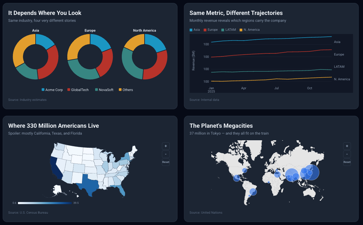
Geographic Maps
Choropleth, symbol, locator, and spike maps
Built-in basemaps with zoom, pan, and smart label placement. Small multiples for comparing across categories. All rendered as clean SVG.
Everything you need to build great charts
A complete chart editor with the tools analysts actually use.
Visual Chart Editor
Pick a chart type, map your columns, adjust colors and labels. Live preview updates instantly as you make changes.
SQL Workbench
Write custom SQL, run queries, and see results in a data table. Map result columns to chart axes. Full DuckDB engine built in.
Drag-and-Drop Dashboards
Arrange charts on a responsive grid. Drag to reposition, resize to adjust. Dashboards auto-layout based on chart types.
Publication-Ready Export
Export as SVG, PNG, PDF, or PowerPoint (PPTX) with embedded fonts for standalone rendering. Download data as CSV. Portable HTML dashboards for hosting anywhere.
Geographic Maps
Choropleth, symbol, locator, and spike maps with zoom/pan and smart label placement. Built-in basemap selection.
Teams & Auth
Magic link authentication, team management with roles, threaded comments on charts, and scoped API keys — use them with Claude Code or any AI agent to create charts programmatically.
Annotations
Add reference lines, text labels, and highlighted ranges with responsive scaling to tell the story behind your data.
Data Transforms
Transpose, rename, reorder, and reshape your data without leaving the editor. Round, cast types, edit cells in place.
Version History
Auto-save snapshots of every chart edit with one-click restore. Save chart configs as reusable templates.
Cloud Deployment
Run locally or deploy to AWS with the included CloudFormation template, Docker images, and S3 storage backend. Step-by-step guide included.
Custom Themes
9 built-in themes, custom CSS, 50+ Google Fonts, and curated publication-ready color palettes. Full light and dark mode support.
Example Dashboard
Ships with The Perfect Dashboard — a showcase of all 25 chart types with sample data, ready to explore the moment you start the app.
How it works
Three steps from data to dashboard.
Connect your data
Upload a CSV, paste data, link a Google Sheet, or connect to Snowflake, PostgreSQL, or BigQuery. Data is ingested into a local DuckDB engine for fast queries.
Build your charts
Use the visual editor to pick chart types, map columns, and style your output. Write custom SQL when you need more control. The AI assistant can help with queries and formatting.
Assemble and share
Drag charts onto a dashboard, arrange the layout, and export. Download as SVG, PNG, PDF, PowerPoint, or a portable HTML file you can host anywhere.
Built with
Your data has a story.
Story Analytics is free and open source. Download the Mac app, explore the example dashboard, connect your data, and start building.